


Challenge
Help take Dyrt, a California-based food waste management service, from a few disorganized pages nested within each other to a clearly articulated site that confidently presents Dyrt as the leading service provider for food waste management.
Solution
Conduct extensive research to determine what factors (cost, convenience, reliability, and others) businesses and municipalities want from their food waste service provider.
Results
A comprehensive site design that utilizes intuitive information architecture and concisely presents products and services in a manner that is highly solution-focused.
Our biggest question: What’s the best way to design a site for a customer that might not want to be there?

Research revealed that Dyrt had two main customer bases:
those who want to compost responsibly
those who do not want to, but will be required to in order to meet state regulations
Our findings meant we needed to design a site that:
clearly articulated its differentiators
delivered a streamlined pipeline for start of service
eliminated any perceived risks customers might encounter while choosing Dyrt as their food waste service.
Most importantly, prioritizing the “does not want to” subset of customers meant we were able to redesign the site to equitably serve them as well as customers that do want to enroll in a food waste service.


Solutioning
Research the Problem Space
Stakeholder + User Interviews
Define the Problem
Affinity Mapping + Market Research + Personas
Iterative Design
Wireframes + Usability Testing Feedback
Deliver
Upped Fidelity + Finalized Prototype
Research the Problem Space
We wanted to find out what Dyrt’s current and potential customers are looking for from their food waste management service.
We conducted 5 user interviews and 5 site usability tests. Our findings:
Customers perceive the entire food waste management process as unnecessarily complicated and arduous
Dyrt’s current customers composted primarily because it made the feel good or proud
Dyrt’s much larger potential customer base, however, needed to compost because they have to in order to avoid fines
Our path forward was clear:
Design for the more difficult customer demographic, those who have to find a food waste service, as this would still serve the customers that want to compost.
0/5
0/5
were able to infer the product dimensions based on the website
“Composting and waste management is not my top priority.”
could freely navigate the site, resorted to stumbling upon info
Using the affinity map below, we were able to sort through our data and allow overall themes to emerge.

Define the Problem
Using our common categories from affinity mapping, we brainstormed how we might best address pain points and reshape negative user emotions.
User Research
Confused About Products & Services
Feels Hopeless About Scale of Impact
Stressed by Difficult Navigation

How Might We…
Instill Trust?
Inspire Hope and Excitement?
Create Confidence?
Solution
Transparent & Concise Information
Digestible & Solution-Focused With Actionable Steps
Intuitive Content Organization
Oliver is the general embodiment of Dyrt’s largest customer base. We created this user to help keep our team anchored to our problem space, solutions, and goals throughout the design phase.
Overwhelmed Oliver
Cafe Owner | Culver City, CA

“Ugh. Another thing for the to-do list…”
Several months into owning a cafe, Oliver is delivered a government notice regarding a new food waste management mandate that could result in fines for business owners.
Already overwhelmed from wearing many hats, Oliver is flustered by this additional stressor and asks his network for their food waste management solutions, who introduces him to Dyrt.
Behaviors


Goals


Avoid fines & comply with regulation. “It’s crazy how much it costs to throw things away. Your margins are razor thin.”
Needs accurate product information “Unsure where I’d put the bin at the restaurant.”
Reliable composting services "Sometimes compost trucks don’t come to pick up the waste.”
Frustrations


Lack of adherence from staff members “People throw the wrong types of sh*t in there.”
Direct quotes from interviews
Questions impact of composting
“My drop-in-the-ocean will not create waves in the eco-footprint.”
Business success comes first “Composting and waste management is not at top of priority.”
Goals
Here are both the comparators and competitors in and outside our market we used to draw additional insights.
This extra research or “window shopping” allowed us to gain inspiration on what other companies were doing well and to see where we could make improvements to stand out from the rest.
Competitors within the
Food Waste Industry


Comparators outside the
Food Waste Industry


We headed to Figma with our redesign strategy in place to begin sketching our initial wireframes.
After completing a handful of wireframes we began usability testing with 5 different potential customers.
Users were asked to navigate the site as if they were Oliver, a business owner, looking for a food waste management service and explain why they would or would not select Dyrt as their service provider.
Usability Testing Takeaways:
Users did not understand that the hardware (Dyrt Bin) and the software (Dyrt Cloud) are integrated.
Copy was too dense. Users just weren’t going to read it.
Remove all barriers to sign-up, ex. heavy environmental data facts and revealing too early that customers will be required to submit three current waste bills to get a quote.


Homepage Low Fidelity Wireframe
Business Page Low Fidelity Wireframe
After a few usability tests, our team had a big “lightbulb” moment regarding the homepage layout.
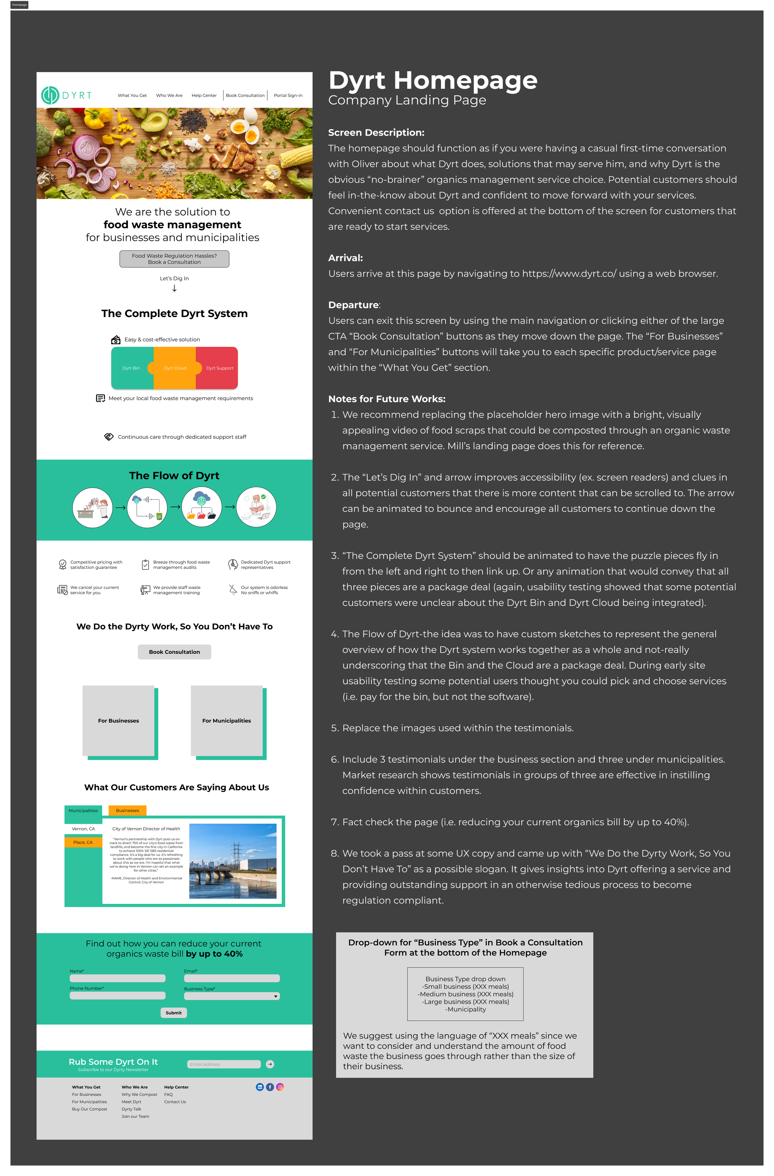
Users were unfortunately still having difficulty understanding exactly what services Dyrt offered and how the software and hardware worked together to provide that service. We realized that we needed to format the homepage as if we were having a first-time conversation with someone learning about Dyrt for the first time.
a.
Lo-Fidelity Wireframe

a. Removed dense copy- “ I am already bored.”
b. Removed environmental facts- “ This isn’t doing anything for me.”
b.
Mid-Fidelity Wireframe

c. Added high-level info overview- “ I really like this, this makes sense.”
c.
High-Fidelity Wireframe
As we each worked on our high-fidelity mockup sections, we continually referenced Dyrt’s style guide to ensure each page was consistent.
Before we upped the fidelity of our frames and worked individually to complete different pages, it was important that we all agreed on a universal frame space formats and layer naming conventions to guarantee that our design handoff to our client went smoothly.

Dyrt’s Style Guide

Team Created Frame Spacing Style Guide
Detailed Annotations Provided to Client
Prototype
Retrospective
Overview
Given the time frame of a three week sprint, we were very pleased with our results. The Dyrt website redesign rested heavily on the extensive research we synthesized. Discovering that Dyrt’s user base wasn’t cleanly split into businesses and municipalities as previously believed was crucial to our design approach. It not only allowed us to reach a larger customer base, but helped us target a site build that emphasized conventional, intuitive content organization, concisely presents products and services in a manner that is highly solution focused. I believe that the redesign will significantly help Dyrt convert a high percentage of site traffic to paying customers.
Project Takeaways
Effectively prioritizing goals in order to honor timelines is key.
If time allowed, we would have liked to address the following:
The importance of sound research and taking the time to solidify each step before moving on.
The joys of working within a dynamic team, collaboration of ideas, and learning from each others strengths. Asana, Google Suite, and Figma enabled us to work in tandem and divide and conquer parts of this project.
Next Steps
Continue to test and iterate on the initial conversation homepage format.
Dyrt Cloud Software prototype with an on-boarding walkthrough available on the website.
Add a page for City-specific links to regulation for customer reference.
Include images and videos of products rather than renderings.
Obtain site analytics once the redesigned website is complete and live.